Comparing Analysis Views in Eggplant Performance Analyzer
Analyzer Comparison Basics
Eggplant Performance Analyzer lets you compare analysis views. Any test run that you've added to Analyzer can be used in a comparison, provided you've created an analysis view for that test run. You can add as many analysis views to a single comparison as you find useful.
Keep in mind, however, that in order to produce meaningful comparisons, the original test runs should be built on the same or similar criteria. That is, the test runs you're comparing should be run under the same conditions: use the same number of virtual users (VUs), run for similar durations, and so forth.
Step by Step: Creating a Comparison
Before you can create visual charts for a comparison, you have to define what analysis views you want to compare. To create the comparison, follow these steps:
- Right-click the Comparisons node in the Project tree and select New analysis view comparison. Alternatively, you can select Comparisons, then click New analysis view comparison on the Analyzer toolbar.
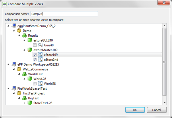
- The Compare Multiple Views dialog box displays the projects and test runs that you have added to Analyzer. Note that this list can include test runs from different workspaces because you can include test runs from different workspaces in comparisons. Navigate to the analysis views you want to use in your comparison, then select the checkbox next to the analysis view name for each one you want to include.
- Enter a name for the comparison.
- When you have added all the analysis views you want to use for this comparison, click OK.
The new analysis view comparison is added to the Project tree beneath the Comparisons node with the name you provided.
Working with an Analysis View Comparison
When you select a comparison in Eggplant Performance Analyzer's Project tree, the Viewer pane lists the analysis views that make up the comparison. Note that this view also includes a Description field, which you can use to provide more information about the comparison.
With an analysis view comparison selected in the Project tree, Analyzer's context-sensitive toolbar includes the following options for working with the comparison:
- Add/Remove analysis views: This option lets you modify the current comparison by adding additional analysis views or removing analysis views that you've previously included. Select or clear the checkboxes in the Compare Multiple Views dialog box to make your choices.
- New comparison chart: Use this option to create charts to visually represent changes in your test runs. See Step by Step: Creating a Comparison Chart below for details about creating comparison charts.
- Create report: This option lets you generate a report from the comparison. The report includes any comparison charts you've added to the analysis view comparison, and you specify the report format (.pdf, .odt, or .html) and a report template. For information about report templates, see Reporting with Eggplant Performance Analyzer.
- Rename comparison: Use this option to edit or choose a new name for the analysis view comparison.
- Delete comparison: Use this option to delete the analysis view comparison; requires confirmation.
Step by Step: Creating a Comparison Chart
An analysis view comparison creates a relationship between analysis views; however, you'll need to create charts for the comparison in order to analyze the performance of your test systems over time. Creating a comparison chart is similar to creating other charts in Analyzer; if you've created charts for your analysis views, the interface will be familiar.
Follow these steps to complete the Create a Comparison Chart wizard:
- Right-click the analysis view comparison to which you want to add a chart and select New comparison chart. Alternatively, you can select the comparison in the Project tree, then click New comparison chart on the Analyzer toolbar.
- Choose the specific data to display on the comparison chart. Select a category in the left column, then choose a statistic in the center column, and what each line should represent in the right column. Note that for any item that includes a triangle beside its name, you'll need to select from the submenu for that value. For instance, if you want to use Rate as your statistic (middle column), you need to decide if you want to display the Maximum, Mean, or Minimum.
- When you've selected the data for the chart, click Next.
- A descriptive name for the chart is entered automatically based on your definition; you can change or edit the name if desired. Use the Notes field to add any additional comments about the definition of the chart. Notes you enter here will appear in the Notes section below the chart when you view it in the Viewer pane.
- Set the Bucket count. This setting limits the number of transactions that are plotted across the x-axis of a chart to the number set by the "bucket." Within each bucket, or division, all the data is averaged to provide the data that gets plotted on the chart. Setting a lower number can speed processing time as well as smoothing some of the peaks and valleys on your charts because you'll be working with fewer data points. The default Bucket count is 100; enter a new number in the field if desired. (To change the default value, go to Tools > Preferences.)
- Click Finish to create your chart.
You can create as many different charts for an analysis view comparison as you want. Charts appear in the Project tree under the comparison to which they belong. To view a chart that you've created, select it in the Project tree. The chart is displayed in the Viewer pane. You can work with comparison charts in the same way as you can with other charts in Analyzer. See Working with Eggplant Performance Analyzer Charts for information about working with charts.
![]() Eggplantsoftware.com | Documentation Home | User Forums | Support | Copyright © 2022 Eggplant
Eggplantsoftware.com | Documentation Home | User Forums | Support | Copyright © 2022 Eggplant