Understanding Charts and Events
The results of a test run in Eggplant Performance are centered around event log entries. As virtual users (VUs) execute their scripts, they record the events that occur and the time at which they occur in a file called an event log. In the test run results directory, there will be one event log per VU in the test.
When a test run is analyzed by Eggplant Performance Analyzer, the entries are read from the event logs and stored in the analysis database. Finally, when an analysis view is created for the test run, the entries are sampled (for efficiency) and any entries outside the specified time slice are excluded. Statistics about the event log entries in the analysis view can be displayed on a chart or in a table.

The key to understanding charts, tables, key performance indicators (KPIs), comparisons, and groupings is understanding how statistics are calculated from a collection of event log entries.

Chart Types
Select a chart type of your choice from the Create a Chart wizard. The following section describes each of the chart types.
Time Series Chart
Time series charts show how statistics changed over the duration of the view. The x-axis is time, divided into intervals called buckets, and the y-axis values are the calculated statistics for the entries in each bucket.

Bar Chart
Bar charts compare counts and averages. Each bar shows a single value for the calculated statistic, aggregated over the duration of the view.

Candlestick Chart
Candlestick charts show a number of calculated statistics, aggregated over the duration of the view. These statistics include minimum and maximum values, percentiles, and averages (if available).

The following image shows what the different lines on a candlestick chart represent:

A candlestick chart is a compact way to visualize trends in the data. For example:

On the left, you can see that the blue series values are contained within a smaller range than the red series values. The red series has more variance; it has values which are higher and lower than the maximum and minimum values within the blue series.
On the right, the blue series values are more concentrated toward the lower end of the range, and the red series values are more concentrated towards the upper end of the range.
Of course, the position of each candlestick relative to the others reveals information about whether the values in a series are higher or lower than another; it's easy to see unusually high transaction response times, for example.
Percentiles Chart
Percentiles charts show what percentage of timings achieved a certain response time. The y-axis is the calculated statistic value, and the x-axis shows percentages from 0 to 100 percent. A point on the chart at (x, y) indicates that x% of the timings displayed on the chart had a response time less than or equal to y.

Scatter Chart
Scatter charts compare two statistics to see if they correlate. The x-axis and y-axis represent different calculated statistics. Each point on the chart represents the event log entries within a bucket, and the (x, y) values show the values of the calculated statistics at the time of that bucket.

Histogram Chart
Histogram charts show the distribution of measurements over the duration of the view. The x-axis is the calculated statistic, divided into intervals called buckets, and the y-axis values are the number (or frequency) of entries in each bucket.
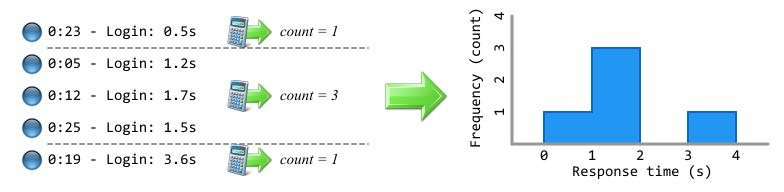
Chart Category
The category of a chart defines what type of entries appear on it. The category is a way of narrowing the collection of entries to focus on a particular type of event log entry, and only calculate statistics about entries of that type.

The possible categories are as follows:
- Event log entries that contain only a message (called Events)
- Errors: Logged by the Error() method in script code, or by various error conditions while the VU is running.
- Warnings: Logged by the Warn() method in script code, or by various warning conditions while the VU is running.
- Progress points passed: Logged by the SetProgressPoint() method in script code when true is passed as a parameter.
- Progress points failed: Logged by the SetProgressPoint() method in script code when false is passed as a parameter.
- Web-specific entries
- HTTP Cache: Logged when the HTTP cache is queried before sending a request. These entries have two series: Cache Hits and Cache Misses.
- HTTP Verbs: Logged when an HTTP request is sent. The series of these entries are the individual HTTP verbs (e.g., GET or POST).
- HTTP Response Codes: Logged when an HTTP response is received. The series of these entries are the individual HTTP response codes (e.g., 200 or 404).
- WebSocket Messages: Logged when a message is sent or received over a WebSocket connection. These entries have two series: WebSocket Messages Received and WebSocket Messages Sent.
- WebSockets Opened: Logged when a WebSocket connection is opened or closed. These entries have two series: WebSockets Opened and WebSockets Closed.
- Network Throughput: Logged whenever bytes are sent or received over the network. These entries have two series: Bytes Received and Bytes Sent.
- Entries which have a value (called Measurements)
- Measurements: Logged by the RecordMetric() method in script code. The value of the entry is whatever number was passed as a parameter.
- System Under Test: Logged either using a Monitoring Profile or from an imported Perfmon or SAR measurements file.
Note: For the Measurements categories, you must choose the name of the measurement as the category when creating charts. This name is either the name passed to RecordMetric() or the name of the counter being monitored. - Entries which have a duration (called Timings)
- Transactions: Logged by the StartTransaction() and EndTransaction() methods in script code. The response time of the entry is the elapsed time between these method calls.
- Failed Transactions: Logged by the StartTransaction() and FailTransaction() methods in script code. The response time of the entry is the elapsed time between these method calls.
- Timings: Logged by the StartTiming() and EndTiming() methods in script code. The response time of the entry is the elapsed time between these method calls.
- Requests: Logged when the Send() method is called on a Request object in script code. The response time of the entry is the elapsed time before an HTTP response was received.
- Other entries
- Virtual Users: Logged when a VU starts or finishes. These entries have two series: Running Virtual Users and Failed Virtual Users.
Statistic Types
Having narrowed down the collection of event log entries by choosing a category, the next step is to decide how the statistics are calculated.
There are six statistic types; however, the types available depend on both the selected chart type and the category. See the Chart Types section above for the way in which calculated statistics are drawn on each chart.
Count
Count is the simplest statistic type. It is the number of entries which have occurred. For a time series chart, the entries in each bucket are counted and the sum added to the previous value, which makes it a cumulative count chart.

| Time series chart | Bar chart | Candlestick chart | Scatter chart | Histogram chart | |
|---|---|---|---|---|---|
| Events (Error, Warning, Progress Point) | Yes | Yes | No | Yes | No |
| Web-specific entries (HTTP, WebSocket, and Network Throughput) | Yes | Yes | No | Yes | No |
| Measurements | Yes | Yes | No | No | No |
| SUT measurements | No | No | No | No | No |
| Timings (Transactions, Requests) | Yes | Yes | No | Yes | No |
| Virtual Users | No | No | No | No | No |
Rate
The rate is the number of entries occurring per second. Rate is calculated by dividing the number of entries by the length of time over which they occur (usually the length of a bucket).

For the aggregated statistics (min, max, mean) displayed on bar and candlestick charts, the collection of entries is divided into buckets in a similar way to the time series chart before the rates are calculated.
| Time series chart | Bar chart | Candlestick chart | Scatter chart | Histogram chart | |
|---|---|---|---|---|---|
| Events (Error, Warning, Progress Point) | Yes | Yes | Yes | Yes | No |
| Web-specific entries (HTTP, WebSocket, and Network Throughput) | Yes | Yes | Yes | Yes | No |
| Measurements | Yes | Yes | Yes | Yes | No |
| SUT measurements | No | No | No | No | No |
| Timings (Transactions, Requests) | Yes | Yes | Yes | Yes | No |
| Virtual Users | No | No | No | No | No |
Value
Only Measurements and System Under Test measurements have a value; this statistic is either the number passed to the RecordMetric() method in script code or a number recorded using a Monitoring Profile or external monitoring system (e.g., % CPU Time).

Many aggregated values are available for use on bar and candlestick charts; these statistics are calculated from the values of the whole collection of entries:
- Min
- Max
- Mean
- Median
- Standard deviation
- 25th percentile
- 75th percentile
- 90th percentile
- 95th percentile
- 99th percentile
For time series and scatter charts, which divide the collection of entries into buckets, the calculated statistic is the mean of the values of the entries within the bucket.
| Time series chart | Bar chart | Candlestick chart | Scatter chart | Histogram chart | |
|---|---|---|---|---|---|
| Events (Error, Warning, Progress Point) | No | No | No | No | No |
| Web-specific entries (HTTP, WebSocket, and Network Throughput) | No | No | No | No | No |
| Measurements | Yes | Yes | Yes | Yes | Yes |
| SUT measurements | Yes | Yes | Yes | Yes | Yes |
| Timings (Transactions, Requests) | No | No | No | No | Yes |
| Virtual Users | No | No | No | No | No |
Response Time
Response time is the duration of Timing entries (including Transactions, Timings, and Requests). This statistic is similar to value, but the value is the length of the timing in seconds. This statistic is the most common type when dealing with transactions and timings because response time is a good measure of performance.

Many aggregated values are available for use on bar and candlestick charts, and these statistics are calculated from the values of the whole collection of entries:
- Min
- Max
- Mean
- Median
- Standard deviation
- 25th percentile
- 75th percentile
- 90th percentile
- 95th percentile
- 99th percentile
For time series and scatter charts, which divide the collection of entries into buckets, the calculated statistic is the mean of the response times of the entries within the bucket.
| Time series chart | Bar chart | Candlestick chart | Scatter chart | Histogram chart | |
|---|---|---|---|---|---|
| Events (Error, Warning, Progress Point) | No | No | No | No | No |
| Web-specific entries (HTTP, WebSocket, and Network Throughput) | No | No | No | No | No |
| Measurements | No | No | No | No | Yes |
| SUT measurements | No | No | No | No | Yes |
| Timings (Transactions, Requests) | Yes | Yes | Yes | Yes | Yes |
| Virtual Users | No | No | No | No | No |
Concurrency
For Timing entries, which have a start time and an end time (including Transactions, Timings, and Requests), it's possible to calculate how many entries are in progress at any one time; that is, how many entries have started but not yet stopped. From a performance testing perspective, it can be useful to know the number of transactions happening simultaneously.

For the aggregated statistics (min, max, mean) displayed on bar and candlestick charts, the collection of entries is divided into buckets in a similar way to the time series chart before concurrency is calculated.
| Time series chart | Bar chart | Candlestick chart | Scatter chart | Histogram chart | |
|---|---|---|---|---|---|
| Events (Error, Warning, Progress Point) | No | No | No | No | No |
| Web-specific entries (HTTP, WebSocket, and Network Throughput) | No | No | No | No | No |
| Measurements | No | No | No | No | No |
| SUT measurements | No | No | No | No | No |
| Timings (Transactions, Requests) | Yes | Yes | Yes | Yes | No |
| Virtual Users | Yes | Yes | Yes | Yes | No |
Percentiles
The percentiles statistic type is applicable only to Timing category entries (including Transactions, Timings, and Requests), which have a response time, and can be displayed only on a percentiles chart.
Splitting by Series
An important part of defining a chart is choosing how to split the series. This step can be thought of as separating the collection of event log entries into distinct groups, each of which appears as a different color and a different line/bar/candlestick on the chart.

It's most common to split the series by the category:
- Errors: by error message
- Warnings: by warning message
- Progress Points Passed/Failed: by progress point name
- Transactions: by transaction name
- Timings: by timing name
- Requests: by request URL
However, it can also be useful to split the series by one of the following criteria:
- Injector: the name of the injector on which the VU was running when it recorded the entry (e.g., to investigate whether different injectors experience different response times)
- Script: the name of the script being executed by the VU when it recorded the entry
- VU Group: the name of the group containing the virtual user which recorded the entry
For entries with a message (Errors, Warnings, Progress Points), there are extra ways to split the series:
- Transaction: the name of the transaction that was open at the time of the entry (e.g., to investigate which transactions caused the most errors/warnings)
- Timing: the name of the timing that was open at the time of the entry
Other series splits include:
- Virtual Users: For the Virtual Users category, this split includes the series Running Virtual Users and Failed Virtual Users
- Machines: For the System Under Test category, if the selected counter was measured on more than one machine, the machine names appear as different series.
- Measurements: For the Measurements category, this split includes a single series with the name of the selected measurement. For the various web-specific categories, this includes the following series:
- HTTP Cache: includes the series Cache Hits and Cache Misses
- HTTP Verbs: includes a series for each HTTP verb (e.g., GET or POST)
- HTTP Response Codes: includes a series for each response code (e.g., 200 or 404)
- WebSocket Messages: includes the series WebSocket Messages Received and WebSocket Messages Sent
- WebSockets Opened: includes the series WebSockets Opened and WebSockets Closed
- Network Throughput: includes the series Bytes Received and Bytes Sent
In most cases, there is a special extra series called <COMBINED>. For this series, the statistics are calculated for all the event log entries in the collection as though no series split were applied. The <COMBINED> series often provides a useful overview. For example, you could use <COMBINED> to view the average response time of all transactions, or the total count of all errors.

Filtering the Event Log Entries
Filtering is a way of excluding specific event log entries from the collection. Filtering should not be confused with splitting the series, which divides event log entries into groups.
Filtering lets you further narrow the focus of the chart or table. It is similar to choosing a category, but more specific. For example, you can look at the errors that happened in a particular transaction by filtering out any errors that happened in any other transaction.

The statistics are then calculated as before but using a smaller collection of entries.
What might be confusing is that series names are also used for filtering, so it seems similar to splitting by series, as described above. However, filtering is fundamentally different.
The following example attempts to find out how different transactions performed on InjectorA:

The following example attempts to find out how the injectors performed differently during login:

Applying the Understanding
Having a good understanding of charts and how the statistics are calculated will help you analyze your data in the most effective ways. This information applies to Eggplant Performance Analyzer in several areas.
Charts and Tables
When creating a chart in an analysis view by using the Create a Chart wizard, the steps of the wizard match the decisions described above:
- Chart type
- Category
- Statistic type (and optional aggregation)
- Split by series
- Filtering (optional)
The calculated statistics are displayed on a single plot, as per the chart type. All chart data can also be represented as a table of values, so the Show table view button or menu item can be used to view the raw numbers.
Chart Templates
The Create a Chart Template wizard is similar to the Create a Chart wizard, with the same steps as above. The main difference is that when you create a chart template, you must specify which series will be visible initially (in the split by series step). Because you might not know what series will appear in a particular analysis view (the chart template can be used in different analysis views), you can use the special values <COMBINED>, <ALL>, <SLOWEST> (for timings), and <MOST FREQUENT> (for count/rate).
KPIs
A single KPI uses a single calculated statistic for all the event log entries in an analysis view. This definition is similar to a bar chart, which shows a single value aggregated over the analysis view.
This calculated statistic is then compared with a target value and given a status of PASS or FAIL depending on whether the calculated value is supposed to be above or below the target.

KPIs can also be drawn on charts. For this to happen, the category, statistic type, and series split of the KPI and the chart must match, and the series to which the KPI applies must also appear on the chart.
Time Series Chart
For a time series chart, a horizontal KPI line is drawn on the chart at the y-position equal to the target of the KPI. You can see at what points the actual series value goes above or below the target value.

Bar/Candlestick Chart
With bar charts and candlestick charts, a horizontal KPI line is drawn on the chart above or below the bar/candlestick to which it applies. The y-position is the target of the KPI. You can quickly see how the KPI target compares to the actual value.

Percentiles Chart
For percentiles charts, a KPI marker is drawn on the chart with the x-position equal to the percentile statistic type. For example, Response Time (90th percentile) would be drawn at x = 90. The y-position is the target value of the KPI, and the tip of the arrow is located at this y-position. The arrow faces up or down depending on whether the KPI is supposed to be above or below the target value. The arrow is also colored green or red to make it easy to distinguish which KPIs have passed or failed. A line is drawn from the marker to the actual value on the series.

For information about creating and applying KPIs to your test runs, see KPIs in Eggplant Performance Studio.
Comparisons
A comparison calculates the same statistic for each analysis view in the comparison, and then plots the calculated values on a line chart.

The Create a Comparison Chart wizard is similar to the Create a Chart wizard. However, there's no option to choose a chart type other than a line chart, and you must choose an aggregation method along with the statistic type (similar to a bar chart, for calculating a single value from all the event log entries).
For more information about comparisons, see Comparing Analysis Views in Eggplant Performance Analyzer.
Groupings
Groupings are a way of manipulating the name associated with a set of event log entries so that they are grouped together when splitting by series. If there are many different entries with similar names, splitting by series can create too many lines on a chart, making it difficult to understand the data or see trends.

Creating a grouping and then applying it during the Create an Analysis View wizard renames entries according to a find/replace regular expression pattern. This process can make event log entries easier to work with when splitting by series.

Groupings are applied at the point of creating an analysis view; they cannot be applied later. Only the entries within the analysis view are renamed, the original names are still stored within the test run results. Therefore, different analysis views of the same test run can have groupings applied in different ways.
Groupings can be applied to the following types of event log entry:
- Errors
- Warnings
- Progress points (passed/failed)
- Transactions
- Timings
- Requests
Grouping is particularly useful if there are many similar error messages, or many requests with similar URLs. For information about creating and applying Groupings, see Using Grouping in Eggplant Performance Analyzer.

On the Test Run Browser window, when you choose a test run to import into the analysis database, one of the Import Options is Include Query Data. By default, this option is turned off, which means that query data will be removed from URLs (as shown above). The query data is removed at the point of analyzing the test run, so any analysis views created within the test run will also have the query data removed from request URLs.
The Include Query Data option reduces the size of the database if it is turned off, which makes it preferable to using groupings to deal with URL query data.
![]() Eggplantsoftware.com | Documentation Home | User Forums | Support | Copyright © 2022 Eggplant
Eggplantsoftware.com | Documentation Home | User Forums | Support | Copyright © 2022 Eggplant