Viewing KPI Statistics Against your Test Runs

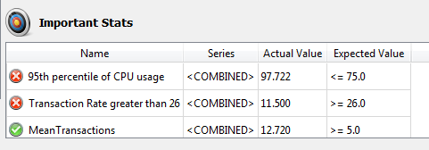
The KPI collection appears on the analysis view summary page as a pass/fail list
The KPIs are listed in a table at the bottom of the analysis view summary pane. Any KPIs that failed (i.e., didn't meet the requirement you set) are listed first in the table and clearly indicated by a red X on the left. Below the failed KPIs you see any KPIs that passed, indicated by a green check mark.
The KPI table shows the actual value achieved by the test run for each statistic as well as the expected value for your KPI, so you can see by what margin tests are passing or failing. Note that if you change or adjust the KPIs in the KPI collection applied to the analysis view, the changes are reflected automatically in what you see in the Viewer pane.
Viewing KPIs on Charts
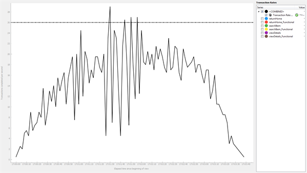
You can also view your KPIs on your charts. When you've applied a KPI collection to a view, KPIs are automatically surfaced on charts to which they apply.
KPIs appear in the Series sidebar under the series to which they apply. For instance, if the KPI is designed against <COMBINED>, you'll see the KPI listed directly under <COMBINED>. If you defined a KPI against a specific transaction, the KPI appears under that transaction.
Initially, KPI checkboxes are not selected. If you want to display the KPI value on the chart, select the checkbox of the KPI. KPIs are represented by a dashed line on the chart.

KPIs show on appropriate charts as a dashed line
For more information about working with charts, see Working with Eggplant Performance Analyzer Charts.