Working with Eggplant Performance Analyzer Charts
Working with Analyzer Charts
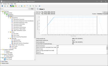
Individual charts associated with an analysis view are listed underneath the view in the Project tree. If the analysis template you used to create the analysis view includes folders, the folder structure is maintained in the Project tree. For example, the Default analysis template includes folders for Transactions, Errors, and Warnings, each containing different charts. When you create an analysis view from the Default analysis template, your view includes those same folders, and within those folders you'll find the expected charts.
Charts appear in the Eggplant Performance Analyzer Project tree under the analysis view
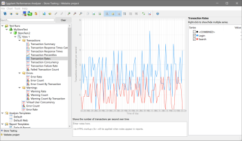
To view a chart, select it in the Project tree. The chart is displayed in the Viewer pane.
Charts are displayed in the Eggplant Performance Analyzer Viewer pane
The chart data is displayed in two sections in the Viewer pane. On the left side, you'll see the chart itself, and on the right you'll see the Series sidebar. When you initially select a chart, most charts display the ten poorest performing data elements from the test data. You can change the actual data that displays in the chart in the Series sidebar.
Options from the Chart
When you hover the cursor over the chart, pop-up windows display additional data about the chart or the specific data point. If you right-click on the chart, you'll find these additional actions you can perform:
- Zoom in/Zoom out/Original size: Use these options to enlarge the view of the chart (Zoom in) or make the view smaller (Zoom out). Original size returns the chart to its full-size view. Note that you can also use your mouse scroll wheel for zooming.
- Copy image to clipboard: Charts can be copied to the clipboard so that you can paste them into other applications, such as Microsoft Word. All visible chart elements are copied, including any labels or values along either axis.
- Export as PNG: Similar to copying to the clipboard, this option lets you create and save a .png (image) file containing the chart. All visible chart elements are copied, including any labels or values along either axis.
Underneath the chart, you'll find a notes field where you can add your own information about the chart. Information you enter here is included when you use this chart in a generated report. Note that you can use HTML markup to format text, if required. For information about reporting, see Reporting with Eggplant Performance Analyzer.
Options from the Series Sidebar
The Series sidebar lists each of the data elements that make up the chart. The first element in the list is always <COMBINED>, which provides a combined overview of all the elements of the data set. The rest of the items in the list are specific to the test and chart you're viewing.
For most charts, only the ten poorest-performing elements are displayed initially, as indicated by their checkbox being selected.
You can show or hide a particular data item on the chart by selecting or clearing the checkbox to the left of the item in the Series sidebar. If the item is selected, hovering the cursor over its listing in the sidebar causes it representation in the chart to become bolded.
When you hover the cursor over a data element on the chart, in addition to the pop-up information that displays with the chart, relevant information also displays in the Value column in the Series sidebar.
Chart Options on the Analyzer Toolbar
When you select a chart in the Project tree, the Analyzer toolbar buttons include options specific to working with charts. Note that some of these options are also available by right-clicking a chart in the Project tree.
The chart options from the toolbar include:
- New chart template from this chart: Select this option if you want to make the selected chart available as a chart template. Chart templates can be selected as part of analysis view templates, making it easy to include a specific pre-defined chart as part of a view. See "Chart Templates" on the Creating Charts in Eggplant Performance Analyzer page to learn more about chart templates.
- Move chart to folder: If you have folders created in the analysis view, you can use this option to move a chart into a folder (or into a different folder). (Note: You create a folder by selecting the view itself, then using the Create a folder toolbar button or right-click option.)
- Link Charts: Use this option to view multiple charts simultaneously in the Viewer pane. See Viewing Charts Simultaneously below for details.
- Unlink Charts: Use this option to remove a link from linked charts.
- Zoom in: Zooms in (enlarges) the view of the displayed chart.
- Zoom out: Zooms out (shrinks) the view of the displayed chart.
- Original size: Returns the view of the displayed chart to its original full size.
- Copy image to clipboard: Charts can be copied to the clipboard so that you can paste them into other applications, such as Microsoft Word. All visible chart elements are copied, including any labels or values along either axis.
- Export as PNG: This option lets you create and save a .png (image) file containing the chart. All visible chart elements are copied, including any labels or values along either axis.
- Export as csv: This option lets you save the current chart data as a .csv file.
- Show series list: This option will show or hide the Series sidebar.
- Show notes: Lets you show or hide the notes field beneath the chart.
- Show grid: Use this button to show or hide the grid display in the chart.
- Show table view: This option lets you view the data set for this chart in a table instead of graphically.
- Show table heat map: This option (on by default) displays a "heat map" of your data within the table view; that is, the most relevant data (generally, the poorest performing) will be brightly colored to highlight it, and other statistics are less bright. Turn this option off to remove the heat map colors from the table. (Note that this button is active only if Show table view is selected.)
- Enable table sorting: This option (off by default) lets you sort data by columns in the table view. Click the table header to sort by a specific column. The arrow icon indicates whether the column is sorted ascending (lowest to highest) or descending (highest to lowest). Click a second time to reverse the sort order. Your sort choices are saved so that they persist between views of a given table within an analysis view. (Note that this button is active only if Show table view is selected.)
- Rename chart: Use this option to change the name of the selected chart.
- Delete chart: Use this option to delete the selected chart from the analysis view.
Viewing Charts simultaneously
You might find it useful to view more than one chart simultaneously in the Viewer pane in order to compare different statistics. You can load additional charts provided they are charts of the same type (i.e., time series, percentiles, and so forth).
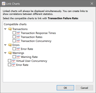
To view charts simultaneously, you can link them. When you select a chart in the tree, the Link Charts button becomes active on the toolbar. (You can also right-click the chart, then select Link Charts.) The Link Charts dialog box shows the other charts in the analysis view of the same type that you can link to the chart you selected.

Select the checkboxes for additional charts you want to display alongside the chart you have selected, then click OK. You can link as many as four charts together with this method. When charts are linked, they open together in the Viewer pane regardless of which one you select in the Project tree.
You can add or change the charts that are linked by selecting a linked chart, then clicking Link Charts to re-open the Link Charts dialog box. To remove the link, select one of the linked charts, then click Unlink Charts in the toolbar (or right-click a linked chart and select Unlink Charts).

You can add notes to the linked charts that persist with any view of those charts. For instance, you might add a note that explains the correlation or the reason why you linked the given charts. If you unlink the charts, any notes you added to the linked charts are deleted.
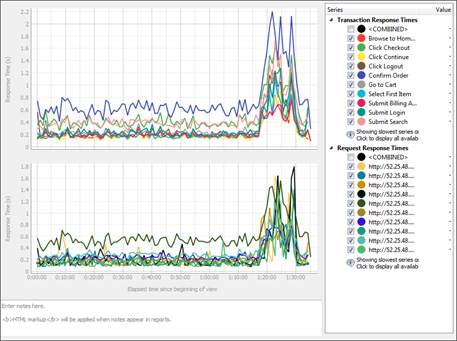
You can also view multiple charts without linking. When you have a chart selected in the Project tree, you can load an additional chart by Ctrl+clicking the chart you want to add. (You can also use Shift+click for contiguous items.) Additional charts stack in the Viewer pane, and series information stacks in the Series sidebar.
You can add multiple charts to the Viewer pane. However, note that each additional chart you add makes all of the charts display smaller, so the number you can effectively display simultaneously is limited by the size of the screen you're working on. Also, viewing multiple charts with this method does not persist. Therefore, if you click away to a different view, the multiple chart view isn't saved.

