Eggplant Monitoring Portal Report Summaries
This page contains summaries of the reports you can view on the Eggplant Monitoring Portal. Note that the descriptions provided are general and that these reports can be configured to suit your specific needs.
Errors
Shows list of all errors either across all monitors or for a specific monitor within a specified time frame, including:
- Current state of error (Open or Closed)
- Error Reference
- Time the error started.
- Monitor affected
- Step (if applicable)
- Severity of error (Yellow, Red, or Black)
- Result Code
- Duration of Error
The Errors report also has filter options to find specific error references, and the ability to view only Open or Closed errors.
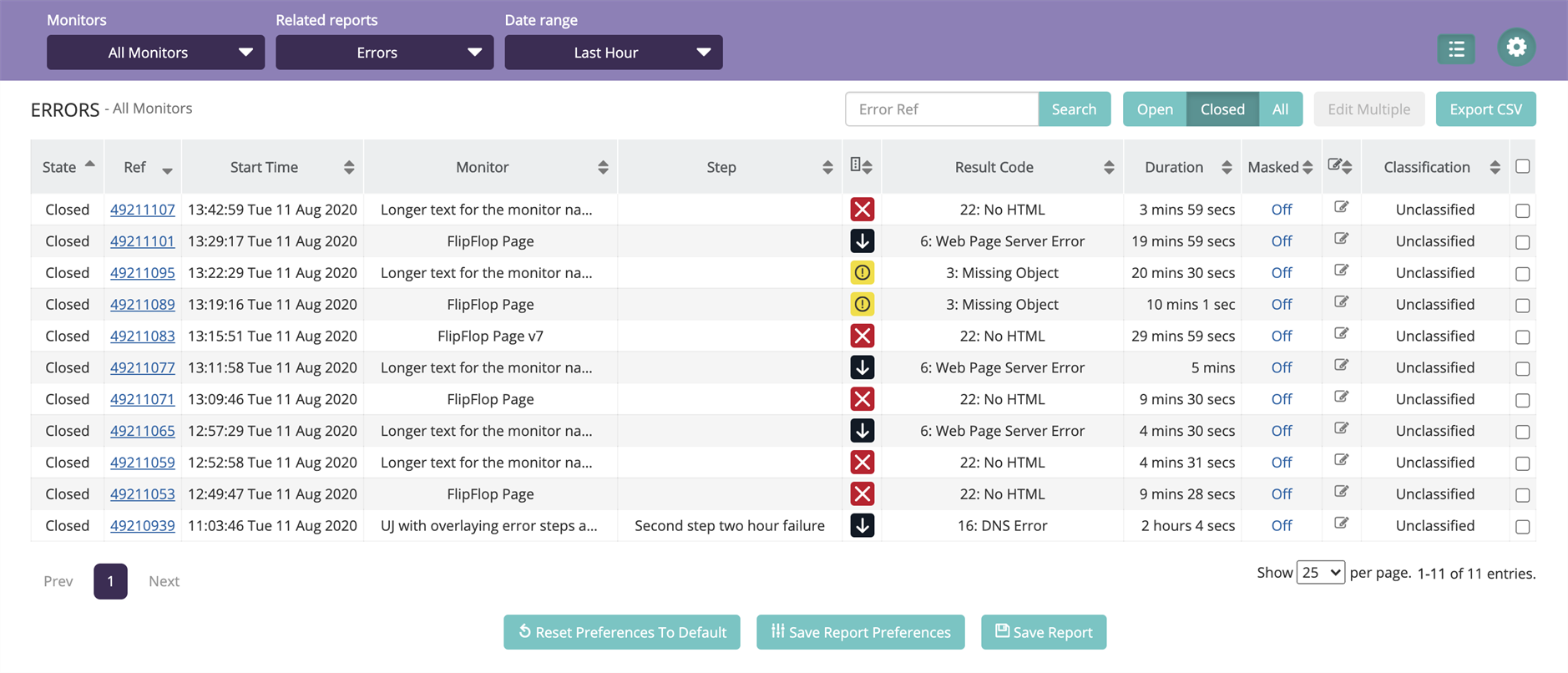
The Monitor ERRORS report
What You Use It For
- Seeing an overview of all errors in a specified time frame.
- Seeing currently open errors.
- Finding specific error references.
- Drilling down into error details and diagnostic information.
Error Trends
Shows the distribution of errors either across all monitors or for a specific monitor over a specified period of time. This report can show:
- Severity of errors (With ability to filter out unwanted data, e.g. no Warnings).
- Number of errors at different severity levels as a percentage.
- Number of errors for specific Result Codes.
- Daily, Weekly, or Monthly view.
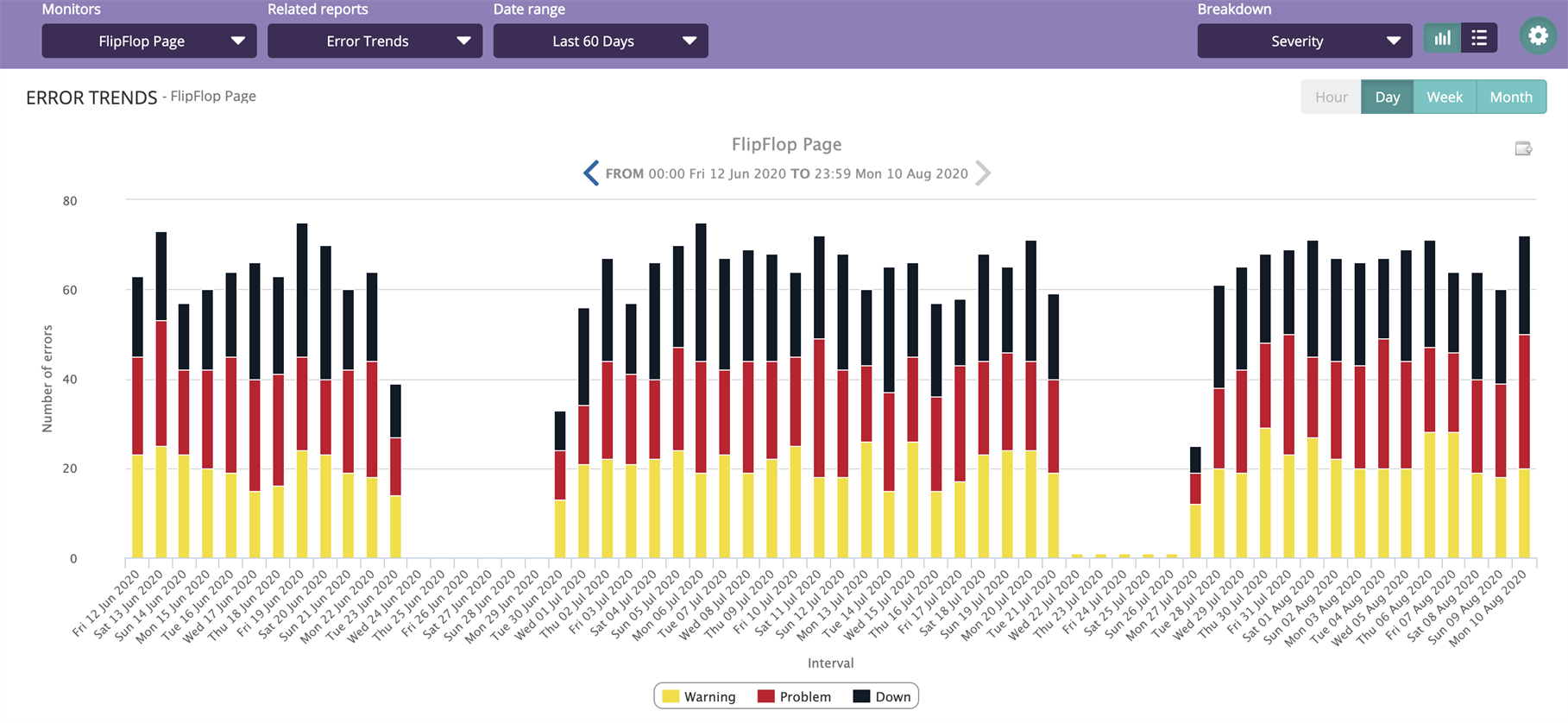
The ERROR TRENDS report
What You Use It For
- Finding patterns in errors.
- Seeing the volume of errors over a given period of time.
- Seeing if there has been a general increase or decrease in errors over a given period of time.
Performance Breakdown
Shows the download duration, along with the CPU and UX Timing metrics of a monitor over a specified period. This report is broken down into the timeline of the following types of metric groups.
Standard Timing
The Standard Timing metrics group will display the Standard Timing points.
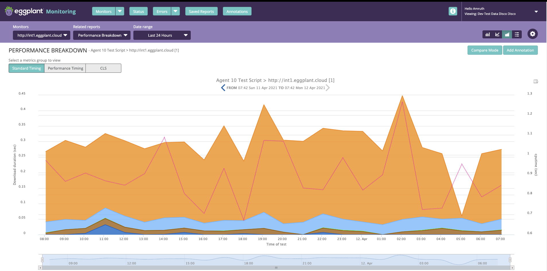
The PERFORMANCE BREAKDOWN Report, Standard Timing metrics group
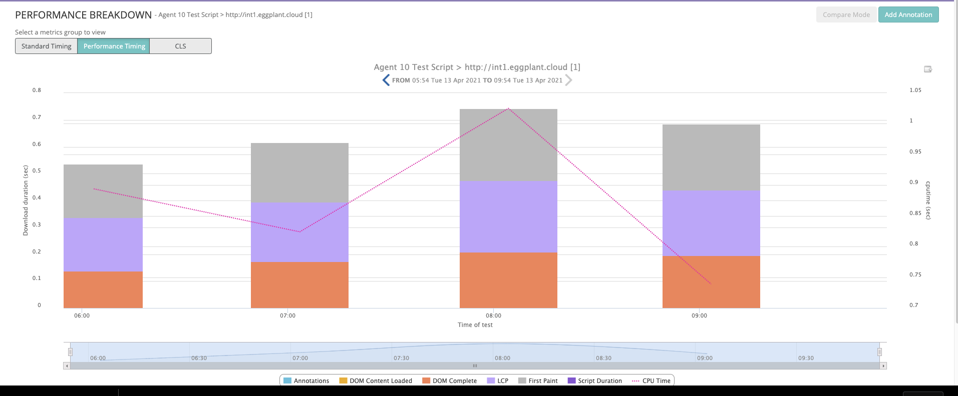
Performance Timing
The Performance Timing metrics group is available for Agent 10 monitors and displays the Performance Timings similar to the Object Waterfall report.
The PERFORMANCE BREAKDOWN report, Performance Timing metrics group
Cumulative Layout Shift (CLS)
The Performance Timing metrics also displays the Cumulative Layout Shift (CLS) timing points. You can view them in a table format along with all the other timing metrics. Click the CSV button in the top-right corner to export the timing metrics for your tests.
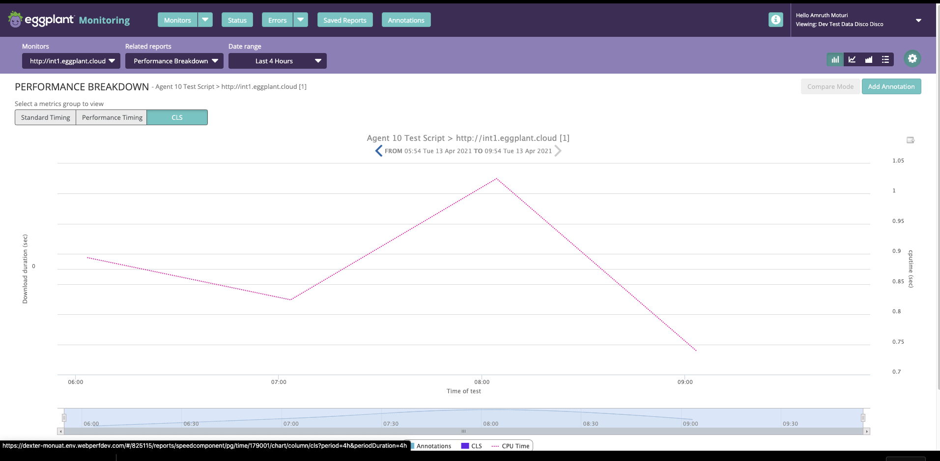
The PERFORMANCE BREAKDOWN report, Cumulative Layout Shift (CLS) metrics group
Optionally, you can display the Page Size and CPU metrics (for Agent 10 monitors only) as well. This report has a Compare Mode functionality, which allows you to compare the Object Waterfall report against two specific tests' Standard timings side-by-side.
What You Use It For
- Seeing the performance of a monitor over time over three different timing groups.
- Pinpointing problems with specific stages of the request (i.e., if Data Start takes longer than usual.)
- Seeing noticeable changes in Download Duration and to compare with Page Size, UX timings, and CPU timing.
- Selecting a specific test result to jump through to its object waterfall.
Object Performance Breakdown (Page or Step only)
Similar to a Performance Breakdown, but for a specified object that was downloaded in the time range for a page or step.
The report shows the object size. You can select any object downloaded in the page or step during the given time range.
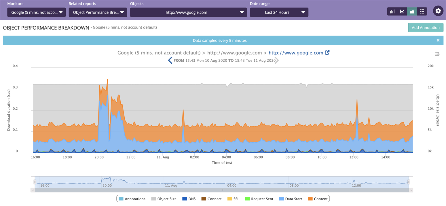
The OBJECT PERFORMANCE BREAKDOWN report
What You Use It For
Good for monitoring the performance of a specific object to identify whether a change in performance or size is intermittent or permanent. In the latter case, it can identify when the change took effect.
Step Waterfall (User Journey Only)
Shows the timeline of the download of each step on the latest test. For each step, the total download time is broken down into the timeline of the different timing points.
All except the last timing point are for the initial request on the step. The Content timing point is for the whole step. In other words, the report shows performance of each step in a user journey, and drills into a Performance Breakdown for each step.
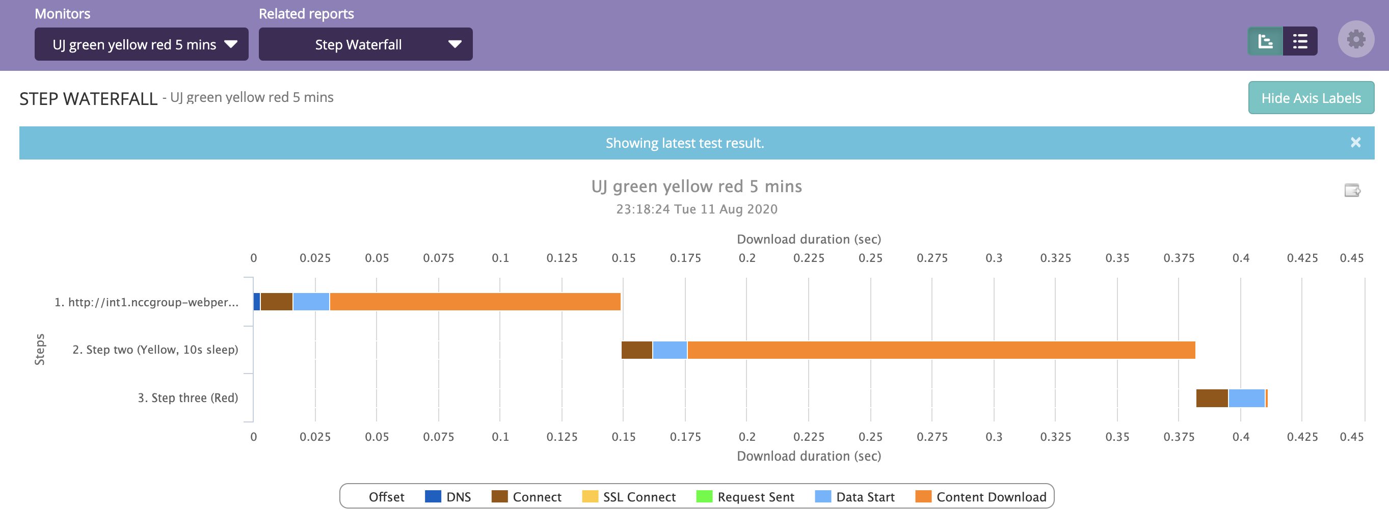
The STEP WATERFALL report
What You Use It For
- Pinpointing slower steps in a user journey.
- Picking up on unusual slowness with regards to specific timing points within a step.
- Seeing the total duration of a journey.
Object Waterfall (Page or Step only)
Shows the performance of all objects including client-side timing and UX related metrics for a specific test on a page or step. Each object has its own row in the graph, with its associated timeline of the different timing points. For more information on the metrics displayed in this report, see the Performance timing points.
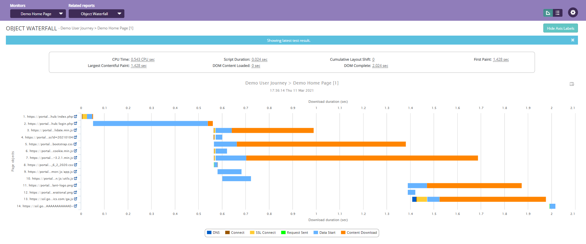
The OBJECT WATERFALL report (Page or Step only)
In addition, the Object Waterfall report lets you view the Javascript console messages, which typically include the total no. of Logs, Info, Warnings, Errors, and Exceptions for a specific test. Contact the Eggplant Support team if you want to get this feature for your monitor.
The feature is available for Agent 10 user journey monitors only.
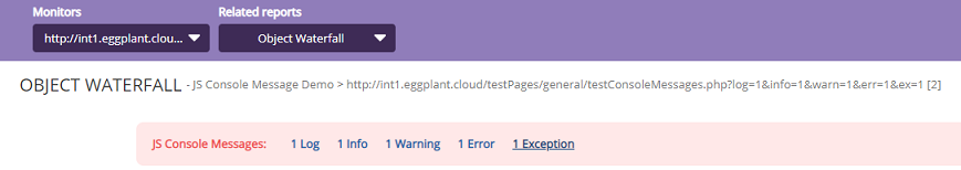
The OBJECT WATERFALL report JavaScript console messages
To view the Javascript console messages, follow these steps:
-
In the Object Waterfall report, click the JavaScript console message type that you want to view. A pop-up window opens providing a description of the message type you selected. The example below shows what happens when you click the Exception link.
-
You can click Copy to use clipboard feature if you want to copy over the detailed information displayed in the JS console for debugging.
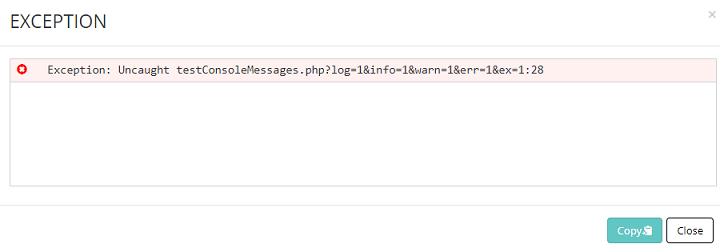
An exception displayed from the OBJECT WATERFALL report JavaScript console
What You Use It For
- Completely breaking down a test, allowing you to see the performance of all objects.
- Pinpointing poorly performing or slower objects on a page.
- Highlighting any objects that can't be downloaded.
Performance Distribution
Shows the distribution of tests over a specified time period according to overall download time. A narrow distribution with a peak as far to the left as possible is ideal.
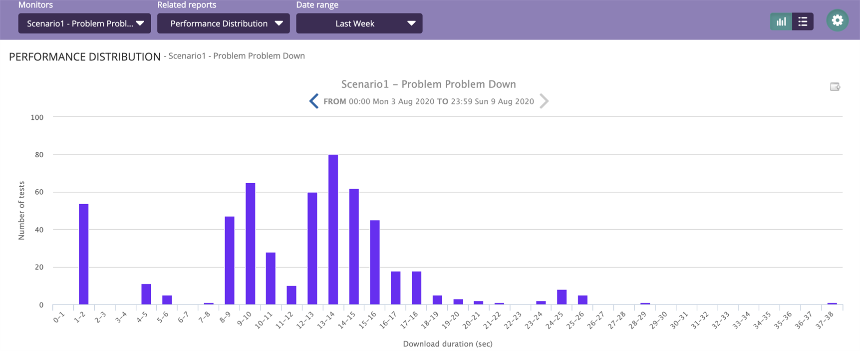
The PERFORMANCE DISTRIBUTION report
What You Use It For
- Seeing the most common performance of page or step and how consistent that performance is.
- Assessing what improvements might be considered, i.e., improve speed or improve consistency.
Performance Trends
Shows performance over time. This report defaults to a candlestick chart that shows a comparison between download duration and the size of the page.
In order to construct each entry, all tests in the specified time period are sorted from fastest to slowest and key points are displayed. For the candlestick chart view, these points are displayed as follows:
- The smaller the box, the more consistent the core performance of the page. The ends show the extreme outliers.
- A box that is closer to the bottom of the graph means that tests are, on average, faster by comparison.
- The mean (average) download time is also displayed.
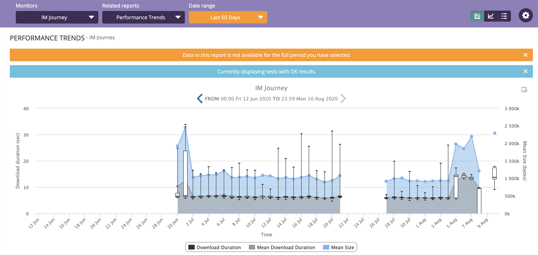
The PERFORMANCE TRENDS report
What You Use It For
- Seeing how performance is changing over time.
- Easily seeing if performance changes are correlated to page size.
- Focusing on the core (middle 50%) of data to eliminate outliers and allow you to concentrate on "typical" performance.
- Seeing the impact of a release.
Test Results
Shows a list of all test results on a monitor in a specified date range, including:
- Date and time of test.
- Type of test (Test, Retest, Manual).
- The server that the test was conducted from (Hovering the mouse over Test Server shows the external IP address of that server).
- Transmitted size of the page (in bytes).
- Uncompressed size of the page once received (in bytes).
- Speed of various timing points during the tests.
- Overall severity of test result.
- Result Code.
Provides a direct link to the related Object or Step Waterfall for each test result. Can also filter out tests at specified severity levels.
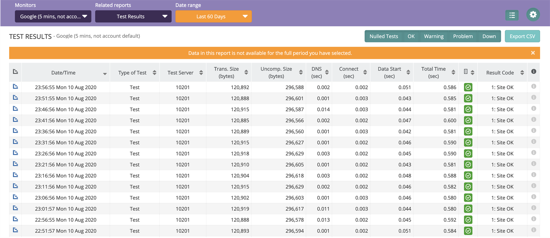
The TEST RESULTS report
What You Use It For
- Seeing a list of all recent test results, or all test results within a specific time frame.
- Finding specific results in order to analyze them further.
- Filtering specific severity levels in order to see results for particular result codes.
Availability
Shows the proportion of tests over a time range that fell within each severity level. Successful tests, which represent uptime, can optionally include Warnings. By selecting two or more monitors on the Monitoring Portal landing page, you can compare availability between all of them in a single graph.
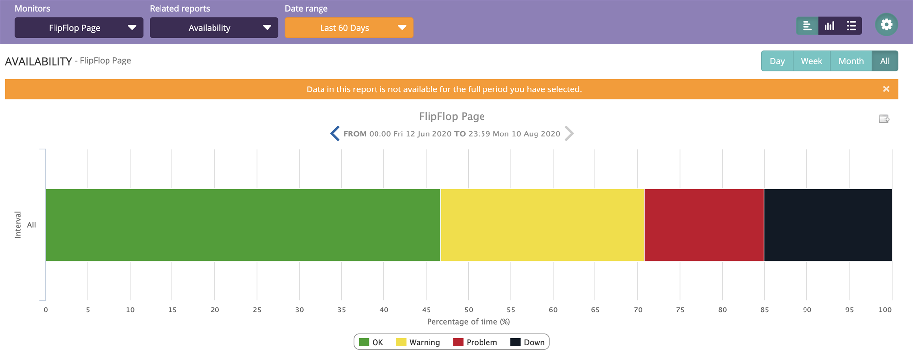
The AVAILABILITY report
What You Use It For
- Seeing uptime and downtime of a monitor over a specific period of time.
- By comparing several monitors you can identify your worst performing monitors.
- How long a monitor is in each severity level.
Step Availability (User Journey Only)
For each step of a user journey, shows the proportion of tests over a time range that fell within each severity level.
What You Use It For
- Pinpointing problematic steps in a journey.
- Seeing which steps in a journey have been more or less available for customers in a specified time frame.
Appearance
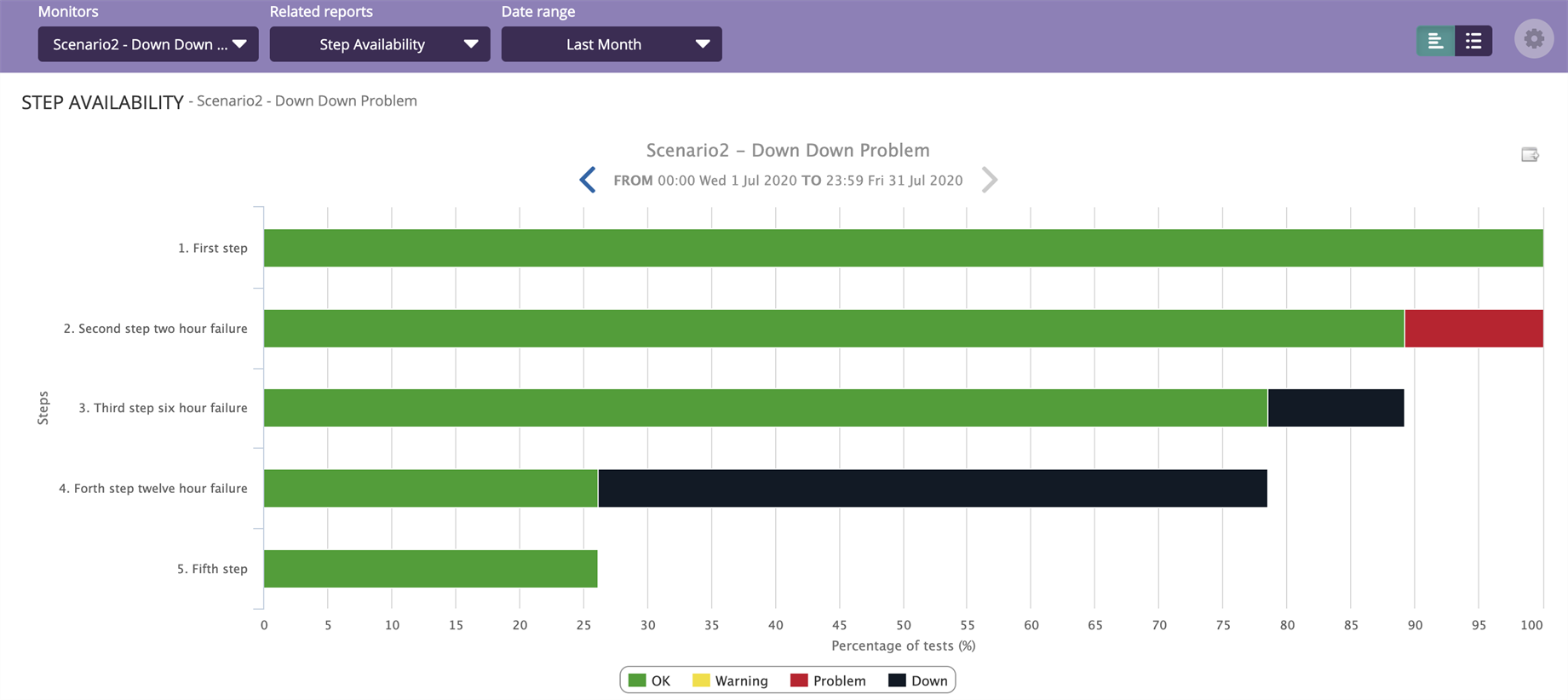
The STEP AVAILABILITY report for user journeys
Severity Trends
Shows the Severity of a monitor and download duration across a specified period of time. This report also has Compare Mode functionality, which allows you to compare the object waterfall for two specific test results side-by-side.
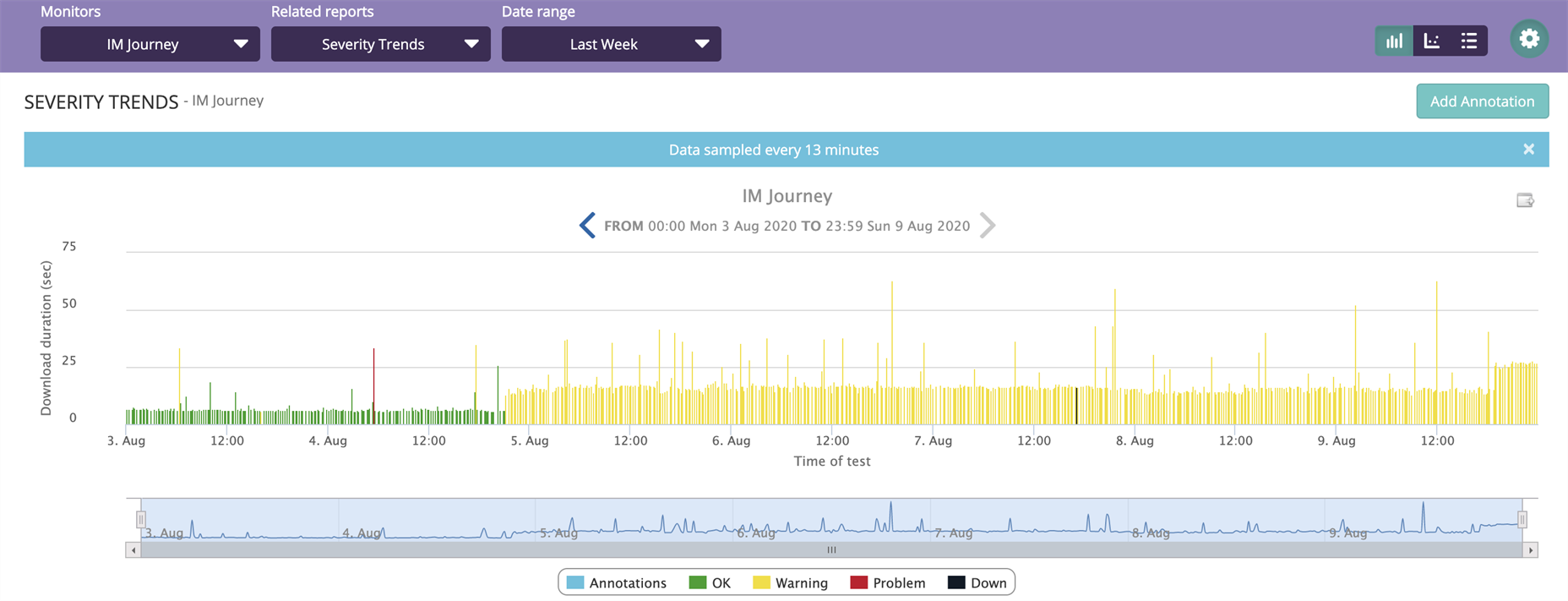
The SEVERITY TRENDS report
What You Use It For
- Highlighting extended periods of error.
- Detecting patterns of error.
- Seeing potential impact on performance of a monitor against severity.
- Comparing tests of different severity levels.
Step Severity Waterfall (User Journey Only)
Shows the timeline of the download of each step on the latest test and the Severity for each step.
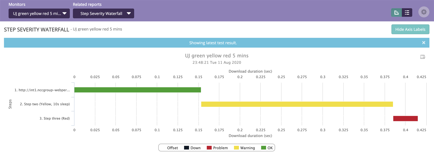
The STEP SEVERITY WATERFALL report for user journeys
What You Use It For
- Showing which steps in a user journey are slower.
- Highlighting which steps in a user journey have issues.