Creating Charts in Eggplant Performance Analyzer
Eggplant Performance Analyzer uses charts to let you fully analyze the test run results data. Charts provide great flexibility because they allow you to investigate multiple aspects of test run results. You can create multiple analysis views for each test run, with each view containing charts that are configured differently.
Charts are the heart of Eggplant Performance Analyzer, and you have a few ways of creating them and adding them to an analysis view:
- Use an analysis template that includes charts when you create a new analysis view.
- Use the Apply analysis template to view option to add a template, including all the charts it contains, to an existing analysis view.
- Use the Create a Chart wizard to add a chart to an existing analysis view, as described below.
- Use the New chart from template option to add a single chart from an existing chart template.
You can't create or view charts in Analyzer without using an analysis view. Charts are stored in the Project tree under the analysis view for which they are created. For information about creating an analysis view, see Creating an Analysis View in Eggplant Performance Analyzer.
Step by Step: Adding a Chart to an Analysis View
If you've created an analysis view and want to add a chart to it, use the Create a Chart wizard option by following these steps:
-
Right-click the analysis view in the Project tree and select New chart. You can also select the analysis view and click the New chart button on the Eggplant Performance Analyzer toolbar.
noteIf your analysis view includes folders for organization, you can create a new chart directly in a folder by right-clicking the folder and selecting New chart.
-
Choose the type of chart you'd like to create, then click Next. Your choices are as follows:
- Time series: Use this chart type to see how statistics changed over the duration of the test.
- Bar chart: This type of chart compares counts and averages.
- Candlestick chart: Use this chart type to compare minimum and maximum values and averages.
- Percentiles: This chart type lets you see what percentage of measurements achieved a certain value.
- Scatter chart: Use this type of chart to compare two statistics for correlation.
- Histogram: This chart type lets you see the frequency distribution of measurements.
-
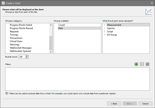
Choose the specific data to display on this chart. Select a category in the left column, then choose a statistic in the center column, and what each line should represent in the right column. Note that the options available for a category are determined by the type of chart you choose, and the options in the center and right columns are different depending on which category you choose.

-
Set the Bucket count. This setting limits the number of transactions that are plotted across the x-axis of a chart to the number set by the bucket. In each bucket, or division, all the data is averaged to provide the data that gets plotted on the chart. Setting a lower number can speed the processing time as well as smoothing some of the peaks and valleys on your charts because you'll be working with fewer data points. The default bucket count is 100; enter a new number in the field if desired. (To change the default value, go to Tools > Preferences.)
noteBucket count is not applicable to Histogram charts.
-
(Optional) You might want to create filters to exclude data that would otherwise skew your chart's results. To add a filter for the chart, click the green plus (+) button on the right side of the Filters section, then follow these steps:
-
Select the category to Filter by from the drop-down list; your choices are:
- Timing
- Injector
- VU Group
- Script
-
Enter the name for your filter in the Value field. For example, if you selected Injector in the Filter by field, enter the name of a specific injector you want to filter by.
-
Select the appropriate option to either include or exclude data with your filter value.
-
Click OK.
noteYou can include multiple filters to act on your chart, and edit or delete filters you've created by using the buttons on the right.
-
-
When you've selected your data and optional filters for the chart, click Next.
-
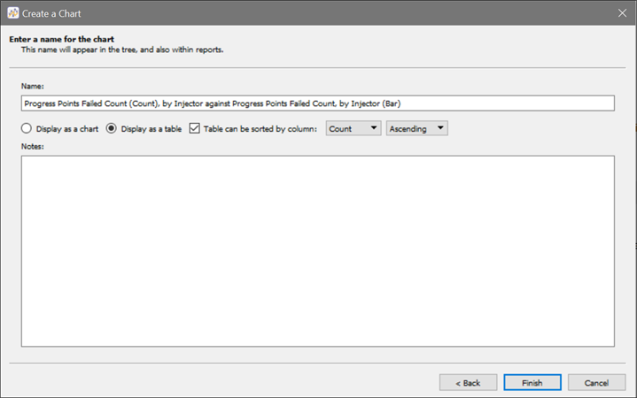
Provide a name for the chart. By default, a descriptive name for the chart is displayed based on your definition. You can change or edit the name as desired.
-
Select from the options: Display as chart or Display as table. Regardless of the selection made, you can use the Show table view toggle on the Analyzer toolbar to switch between the chart and table views after the chart is created. If you select Display as table, you have additional options for how the table is created:

-
Select the Table can be sorted by column checkbox, then choose the column from the drop-down list if you want to set the initial sort order for the generated table. You can also choose whether the data is sorted Ascending or Descending.
-
Use the Notes field to add any additional comments about the definition of the chart. Notes you enter here will appear in the Notes section below the chart when you view it in the Viewer pane.
-
Click Finish to create your chart.
The new chart appears under the analysis view for which it was created, typically at the bottom of the list of charts. However, if you selected the New chart option on a folder within the analysis view, the new chart appears under that folder.
Note that you can create folders and organize your charts within an analysis view as described in Working with Eggplant Performance Analyzer Analysis Views.
Chart Templates in Analyzer
Eggplant Performance Analyzer uses chart templates to make it easy to reuse charts on different test runs or data sets. The chart template defines the type of chart (i.e., bar chart, time series, and so forth) and what data the chart displays—basically, the same information you would include in the Create a Chart wizard, as described above.
You have two methods for creating a chart template:
- Create a new chart (as described above), then right-click the chart and select New chart template from this chart. This method lets you view the completed chart before deciding whether you want to use it as a template for other charts.
- Use the Create a Chart Template wizard by right-clicking Chart Templates in the Project tree. The steps for this wizard are the same as for the Create a Chart wizard (described above). The benefit of this method is that it lets you create a chart template before you've created an analysis view.
Chart templates are found in the Chart Templates node in the Project tree. Note that Analyzer has a list of default (pre-defined) chart templates, which are available in any project or workspace. Additionally, when you import test run data, you can use the Create chart templates for SUT measurements option on the Test Run Browser to have Analyzer create chart templates based on SUT metrics from the imported data.
Chart templates that you create are local to the project in which you create them. That is, your templates are available only to the specific project in which they are defined and won't be available to you in other projects or workspaces.