Default Chart Template Descriptions
Eggplant Performance Analyzer provides default chart templates that let you display data views of your test run data for common analysis needs. The chart templates are found in the Project tree under the Chart Templates node.
You can define your own chart templates; see Chart Templates in Analyzer for information about creating chart templates. However, the following default (i.e., pre-defined) chart templates are available to you:
Error Count, By Description & Warning Count, By Description
These bar charts split out each error (or warning) that occurred in the test and show the number of times each occurred.
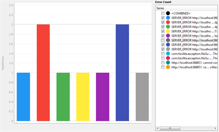
Note that if you're not using groupings (or if an ineffective grouping has been applied), this chart type has the potential to show a large number of errors, each with its own bar.
For example, take an error with this message:
Error: Unable to open account with ID 59385: Access Denied
And you have another error:
Error: Unable to open account with ID 601: Access Denied
You could have many of these errors logged in a test, each with a unique account ID. Without grouping, they would all be identified as unique errors because the specific text is different, but the underlying problem is the same in each case. You probably want to consider these as the same error, which is what grouping lets you achieve. For information about using grouping, see Using Grouping in Eggplant Performance Analyzer.
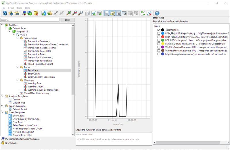
Error Rate, By Description & Warning Rate, By Description
These charts show the rate at which errors (or warnings) occurred throughout the test (e.g., 15 minutes into the test, there were 2.6 errors being raised per second).
You can use this chart type to see if more errors occurred at a specific point in time during the test or if they were consistent throughout. Errors occurring at a specific point in time tend to suggest a temporary environmental or application-specific problem; an even distribution of errors throughout a test can point to a problem with the way the script was written.
Failed Transaction Count
This bar chart shows how many times each transaction type failed. It is useful for identifying any transactions that are more likely to fail.
![]()
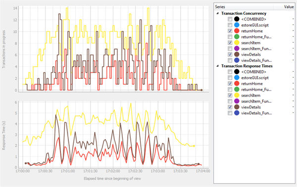
Transaction Concurrency, By Timing
This chart shows the number of active transactions over time. For any point in time, you can see how many transactions were running, as well as which transactions they were.
![]()
Transaction Failure Rate
This chart shows how frequently transactions were failing throughout the test (transaction failures per second). A spike in failure rate usually indicates a problem with the system under test.
![]()
Transaction Percentiles, By Timing
This chart shows the transaction response times as percentiles. Response times are shown on the Y-axis and the percentage are displayed across the X-axis.
This type of chart is often used for tracking performance of statistics such as service level agreements (SLAs). For instance, say you have a 95th percentile value of 3.05 seconds. This value means that 5% of transactions were slower than 3.05 seconds. It also means that 95% of transactions were equal to or faster than the indicated value.
You can often make conclusions based on the "curve" of the lines on the chart. Take the following example:
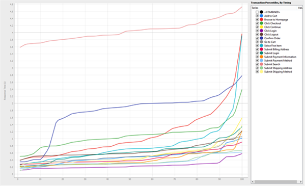
Notice that the Confirm Order transaction (dark blue) has a different profile from the other lines on the chart. Based on this profile, you could say that Confirm Order has the ability to perform quickly (15% of them responded in under 1 second), but it usually took between 1 and 2.8 seconds.
Transaction Rates, By Timing
This chart shows the number of transactions per second over time; in other words, it tells you how frequently transactions are executed. Typically, you'll want to view the <COMBINED>, test-wide transaction rate. Transactions per second (TPS) is generally the preferred way of stating how much load a test has produced, rather than something like virtual user concurrency.
![]()
Transaction Response Times Candlestick
This chart shows the variation in response times for each transaction in a candlestick representation. Each candlestick represents a single transaction, where the lines indicate the quickest response time (lowest point), the median, the mean, the 95th percentile, and the maximum response time (highest point).
This chart is useful for picking out poor performers quickly. Take for example the following chart:
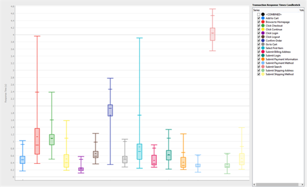
The candlesticks that reach high on the Y-axis are transactions that are poor performers. In this example, the Submit Search (pink) transaction is averaging around 4 seconds, which isn’t very good, especially since the minimum (the lowest point on the line) is also high, meaning it always takes at least ~3.5 seconds for it to complete. These values are considerably higher than any of the other transactions.
Transaction Response Times, By Timing
This chart shows the variation in transaction response times over time. This chart is useful for looking at response time trends and how these (potentially) change as the test progresses. For example, say you are constantly ramping up virtual users in order to reach the breaking point of your system under test (SUT), you would use this chart to see when that breaking point occurred (i.e., at what point in time did response times become unacceptable).
However, knowing only when that breaking point happened probably isn't enough information. You would likely also want to see how many users were active at that point in time, or how many transactions per second were achieved. You could correlate such information by loading the appropriate chart as a duplicate in the Viewer pane. To view multiple charts simultaneously, use Ctrl+click on the charts in the Project tree to load them in the Viewer pane:
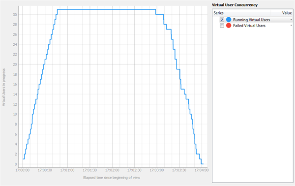
Virtual User Concurrency
This chart shows the number of active virtual users (VUs) over time. You can also add Failed Virtual Users to the chart in the Series sidebar.
Using Default Templates
You use chart templates within analysis templates to provide the specific charts you want to view. All of the default chart templates are included in the Default analysis template, so if you create a view from the Default analysis template, you see charts of your data from all the default chart templates.
To get a more customized view of your data, you could create an analysis template that included some of the default templates and some custom chart templates that you've added, focusing on the information relevant to your testing situation.